
The fact that I’ve never heard of the corporate death penalty until now, but they’re bringing back the actual death penalty says everything.


The fact that I’ve never heard of the corporate death penalty until now, but they’re bringing back the actual death penalty says everything.


I think the STEM fields very well supports this. There are entirely new protocols, software, structures, algorithms, technologies and tons more coming out year over year.
All those fields aren’t exclusively supported by fresh college students. Those are people who are having to constantly learn to stay in their field. If you don’t keep learning, the entire industry becomes inaccessible.


Sure, but this doesn’t change the fact that it’s the fault of the OS and that the user shouldn’t have to take these steps. I totally believe Windows does this, but not that it has any legitimate reason to happen.


There’s nothing the sysadmin should have to worry about here. This is entirely on Windows. No other system in existence just fills up the space of the drive it’s on like this. This isn’t configured poorly. It’s just a bad OS.
Sadly, this has the same issue as the DO WHATEVER THE FUCK YOU WANT license because it doesn’t protect the creator from liability. Otherwise, I always love these parody licenses.
Great explanation, thanks
Yeah, I’d like a breakdown as well. I definitely don’t know enough about MTG.


If you want to learn Ubuntu, download Ubuntu.
If you want to learn Arch, download Arch.
If you want to learn Linux, download Slackware.


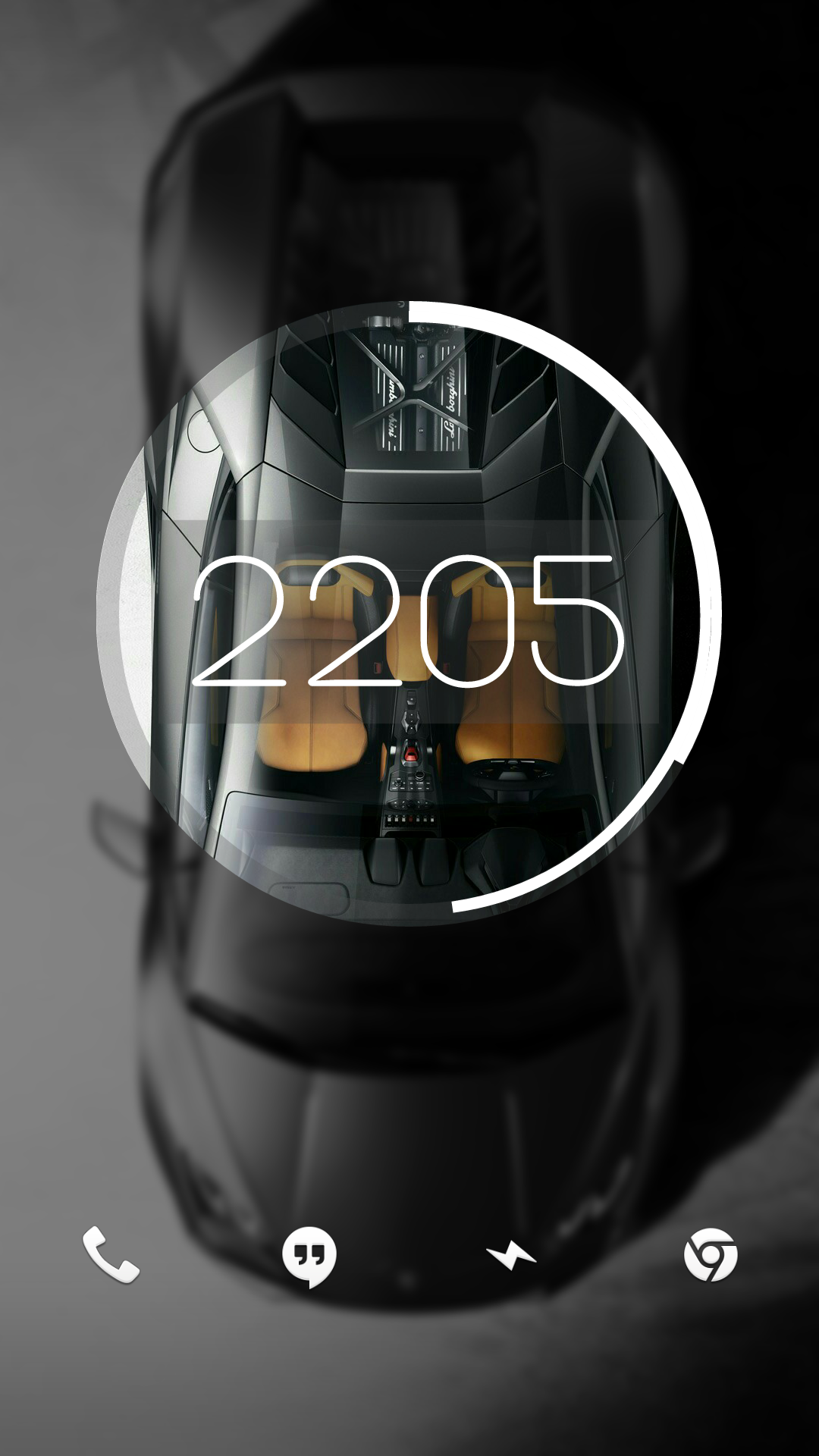
Right on. I’ve moved onto a dirty iPhone since, but here’s a screenshot of my super old Android setup back from when Material was new. After Android took out all the fun stuff custom ROMs could do, I sort of fell out of love with Android.

I had a cool feature at one point where it started out looking like this and unlocking it would make the circle expand and the background would show in full.
Man, I miss early KLWP


Any time! I’m a graphic nerd with none of the book learning, but I do work at a screen printing shop, so I have some intuitive understanding of logo/icon design, but don’t have the theory to go with it.
In other words, I have wildly subjective opinions that I’ll randomly dig my heels in on. (Sometimes when I have no idea what I’m talking about ha!)


Take these icons, add one more layer of simple gradient shading: perfection
For example, GIMP’s icon looks especially bad here to me. If it had just a hint of black shading, it would look massively better (imho).


I think I’m in the same place. I really like the idea of icons having depth. Modern icons are very versatile, but lack personality. Having some depth gives them some weight, but never really liked the emphasis on curves and gradients. I think a mix of original Material design and just a hint more depth would be the perfect sweet spot.

Total hidden fem I watched recently called Kevin Can F— Himself. It’s a unique concept where any time the titular at character is on screen, it’s filmed like an 80’s sitcom. As soon as he leaves set, it’s a stark drama.
Really unique concept and haven’t seen anything like it before. 2 seasons with a proper ending. It’s currently on Netflix.
Another better known one is Yellowjackets. Although, major gore/stress/horror warning on that one.
Not being able to see the face of the person who does the stupid thing also has a massive impact on how people think of the other drivers. Similar to how (most) people who would chew someone out over the phone will hesitate to do the same in person.
My phone support days had way more customers willing to be nasty than any of my retail jobs.
I don’t know of the community is still going with the release of Apple Silicon, but you used to be able to with the Hackintosh project. I can’t imagine you still can with the switch to ARM.
Thankfully USB-C can handle both of those protocols. Just like with Micro USB and Mini before it, it will just take time until the ecosystem catches up. Just, this time, you can run the entirety of possible data streams through a single port.